The people receiving your headshot do not talk about clothes
We went looking for casting directors on the record about wardrobe. Here is what the largest, most current sources actually contain.
Three places you would expect to find it
Any page that opens by telling you your shirt is the biggest decision is lying to you. If your photograph does not look like you walk into a room today, no colour choice rescues it. Get the likeness and the currency right first — that is Chapter II — and treat this chapter as the third thing you optimise, not the first.
And yet clothes work below the level anyone introspects about
There is one study that used the actual headshot crop — faces presented frontally, chest up, with the upper-body clothing independently rated as looking richer or poorer. Nine studies, published in a leading journal.
The same face, judged more competent in "richer" clothes
And the counterweight is equally real. Separate eye-tracking work found faces capture the first two fixations in the overwhelming majority of trials. The face wins the first look almost every time — but the judgement has already moved before the eye gets there. Both are true.
Four caveats that must travel with that study every time
Nobody decides in three seconds. Here is the real viewing condition.
"Casting directors decide in X seconds" is made up, and the number changes every time it is repeated. No primary source exists for any version of it — a point Chapter I makes at length. Two things are defensible, and they are more useful.
First: trait impressions from a face form at roughly 100 milliseconds and do not sharpen with more time. Not seconds — a tenth of one second. And a detail nobody quotes from that same work: between 100ms and 500ms, judgements got more negative.
Second, and more useful still, from a casting director on the record about how she actually views submissions: forty-eight to ninety-six thumbnails a page.
At thumbnail size, in a grid, scrolled quickly: contrast survives, detail does not. Anything that depends on being looked at closely is not going to be. That is the argument for simplicity — not a rule someone invented, but a description of the screen your photograph is competing on.
Four rules that have expired, and one that moved
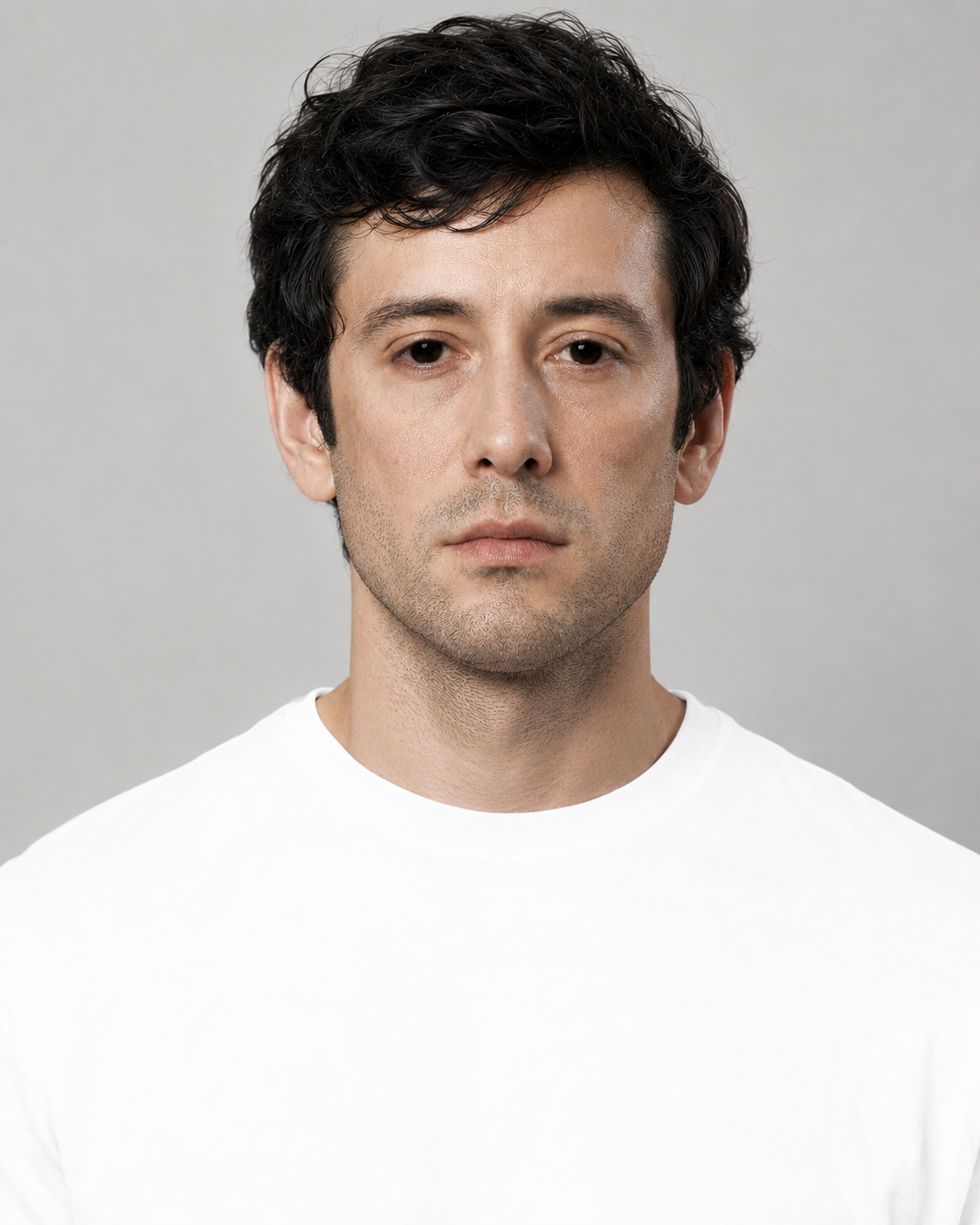
1. "Never wear white"
This was a real constraint and it is a film-era one. The mechanism, described honestly by a twenty-year LA specialist who has published both sides: she deliberately overexposes to flatter skin, which makes light garments glow — forcing a compromise where you underexpose the skin so the outfit behaves, and then the face does not look good.
Her 2026 position, in her own words: white and pastels used to be a rule to avoid entirely, and that is no longer true now that post-production can bring down a hot white.
A subject's textured-black to textured-white range is about six stops. A modern full-frame raw file holds twelve to fifteen. A six-stop subject fits comfortably inside a fourteen-stop sensor.
A white shirt does not clip because it is white. It clips because it is lit too hot. That is a lighting ratio, which is the photographer's decision — not a wardrobe rule that is yours.
That underexposure compromise fell hardest on dark skin in white clothing. The rule that expired was, in practice, a rule that penalised Black actors more than white ones. Worth knowing if you have been told to avoid white your whole career. Chapter XV carries the rest of that argument.

2. "Wear blue because it reads trustworthy" — we traced this one all the way back.
A recruitment PR survey about interview suits
3. "Wear colours that make your eyes pop" — the most repeated colour advice in the genre. No study exists. The only relevant physical law predicts the opposite, and two named experts give diametrically opposite versions of the instruction. Treat it as taste, not technique. If you like your grey jumper, wear your grey jumper.
4. "No patterns — they cause moiré" — right by accident, wrong about why, and the risk did not disappear. It moved.
Moiré is a sampling failure, not a fabric defect. At capture in 2026 it is largely solved — pixel counts rose faster than the risk. But the delivered image is not viewed at capture resolution. Casting platforms want images in the region of 500 × 700 pixels, and then render them in a grid of dozens per page.
A pinstripe perfectly resolved by a forty-five megapixel camera can absolutely shimmer in the thumbnail grid a casting director is scrolling.
And the corollary that matters more to you: a self-tape at 1080p samples about two megapixels. A stills camera captures around forty-five. Moiré is close to dead for the headshot and thoroughly alive for the self-tape. The shirt that is safe in your photograph may not be safe on your tape — which is why the self-tape wardrobe chapter bans stripes and this one does not.
Now the actual garment
Dismantling a rule and replacing it with nothing leaves you worse off than the blog post that told you a lie. Colour and pattern are the surface. Here is the object.
Five things that are actually in frame
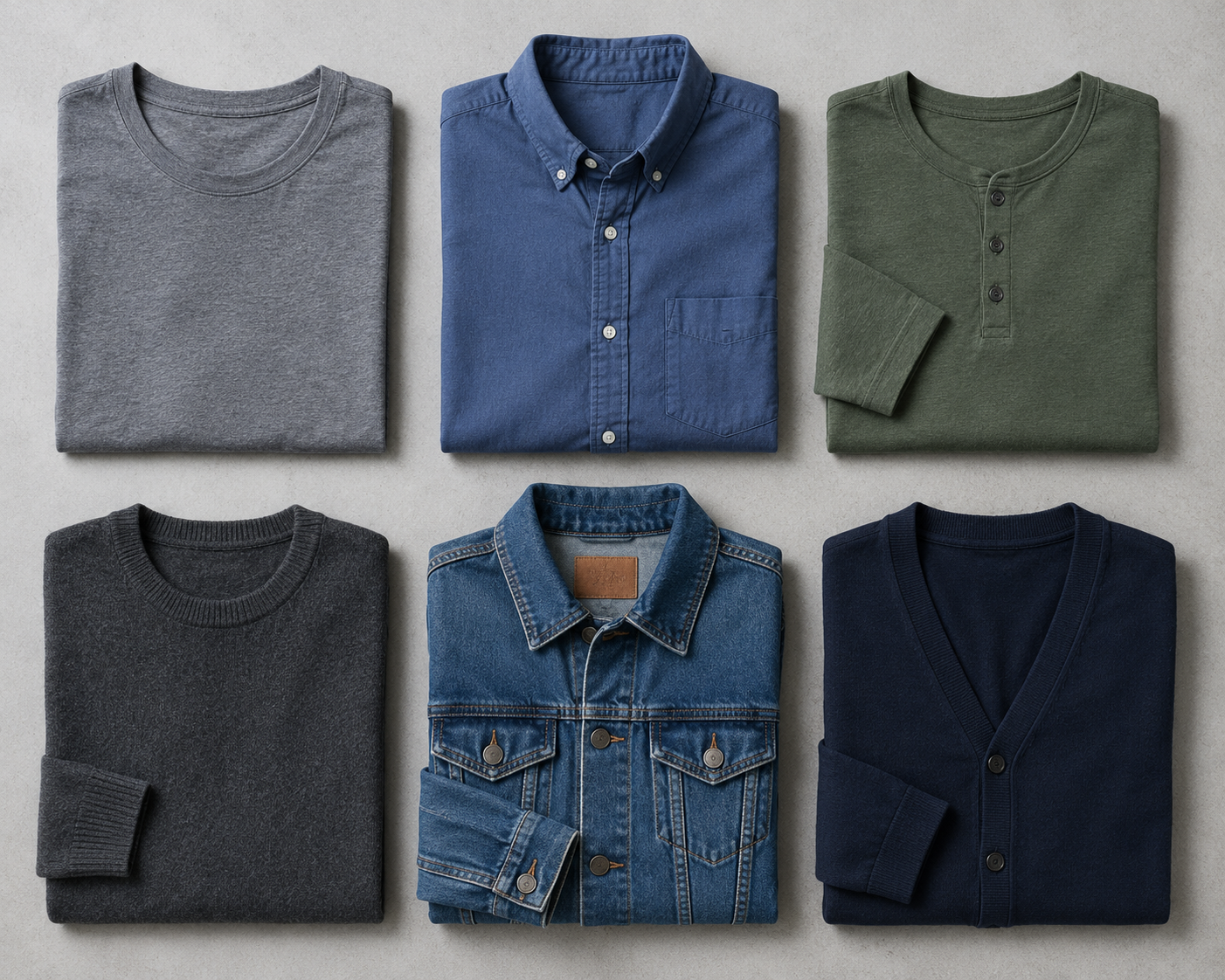
At a chest-up crop, the only fit variable genuinely visible is where the shoulder seam sits. "Fitted" is a proxy for "shoulder seam on the shoulder point." That is specific, checkable in a mirror, and free.
Note that the strictest photographer in the field refuses to make fit your problem at all — he calls it something he handles in the studio rather than a reason to go and buy tighter shirts.
One expert says a V-neck frames the face. Another says crewnecks are best. Neither offers evidence — and a third dissolves the argument entirely: a V-neck gives a stronger, edgier look; round and crew give a softer one.
They are not disagreeing about quality. They are stating preferences for different character registers without saying so. Pick the one that matches what you are selling.
The people who ban sleeveless tend to be corporate specialists; actor specialists list tanks and straps among recommended tops. And the rule is incoherent on its own terms — the same sources who ban bare arms permit a deep V, which is also skin, also below the face, also in frame.
Even the strictest voice in the field explicitly permits a quiet check. Everyone who bans patterns qualifies it — busy, loud, bold, tiny, high-contrast. On stripes, two named professionals flatly contradict each other, and it is not resolvable. We are not going to pretend otherwise.
No casting director and no regulator says you need new clothes. Every serious prep guide's actual requirement is condition — clean, pressed, steamed, crisp, not wrinkled.
The single highest-leverage wardrobe purchase for a headshot is a travel steamer, not a shirt. And it connects directly to the study above, where the cue was cut, fit, coordination and condition rather than price.
No logos. Not because it looks unprofessional — because a brand on your chest can silently disqualify you from every competing brand in commercial casting. You cannot credibly be submitted for a Pepsi spot in a headshot where you are wearing Coca-Cola. Commercial casting is obsessive about conflicts, because conflicts are a legal problem for them rather than an aesthetic one.
So the swoosh is not a style crime. It is a submission you will never be sent up for, and nobody will ever tell you it happened. Everything else on this page is a preference. This one is a mechanism.
Glasses: no named expert defends the ban
Not one. Every named photographer we found says the opposite — that they are part of your personality, that if you wear them daily you should wear them, that lighting can be adjusted to kill glare, and from one studio: bring every pair you own, because anti-glare coatings vary more than people realise.
The academic picture is more interesting than either camp. Both full-rim and rimless glasses increased perceived intelligence; full-rims reduced perceived attractiveness; rimless increased perceived trustworthiness. And on recognition, full-rims slowed face-matching but did not reduce accuracy.
In a world of ninety-six thumbnails a page, "slower to match" is a real cost. But accuracy is unharmed. That is a decision to make, not a rule to obey — and we found no casting director anywhere on record about glasses, which is striking given how confidently the rule circulates. One rule that is not contested: never wear photochromic or transition lenses to a session. They darken under studio light and hide your eyes.
Jewellery: the weakest rule in the book
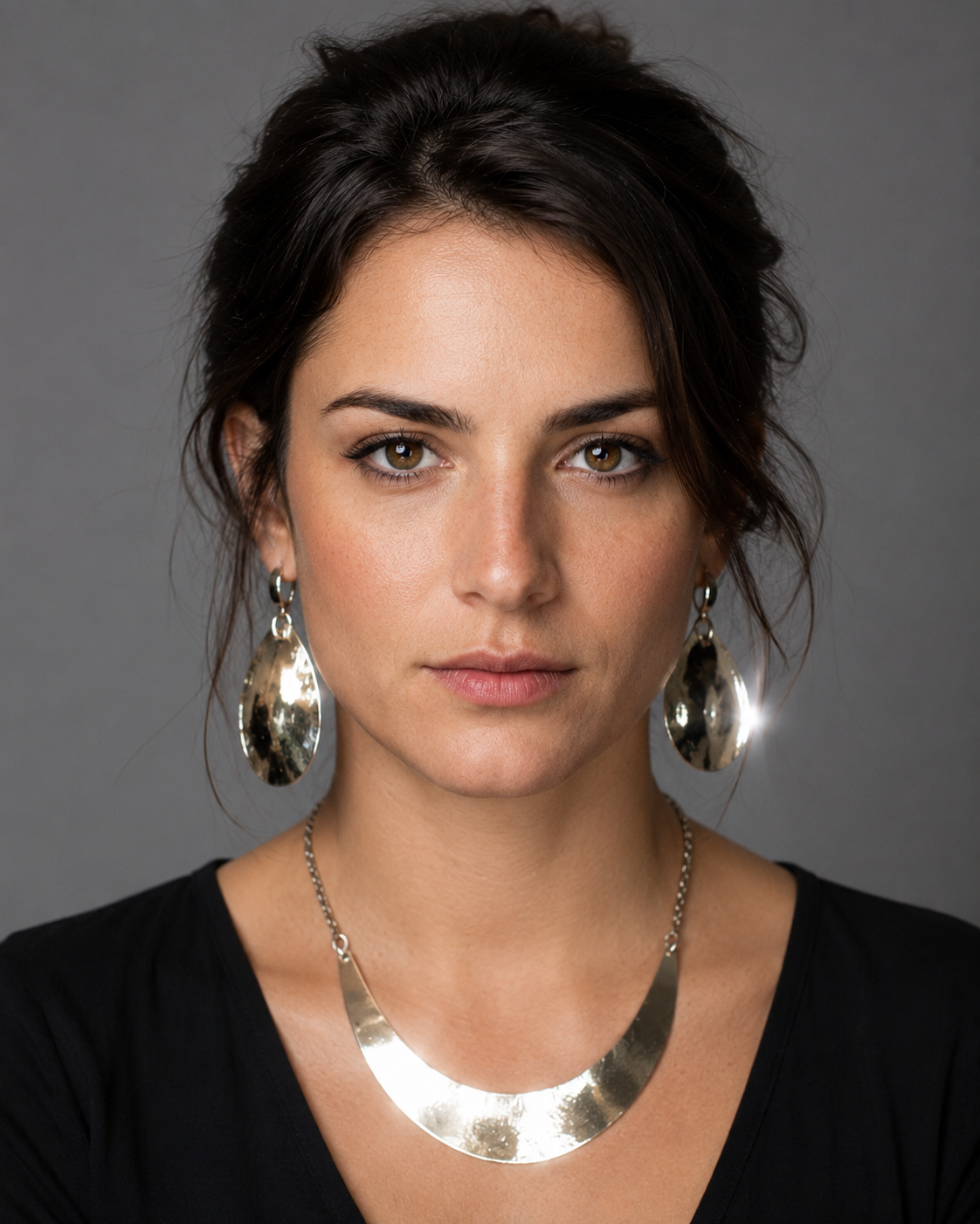
UK guidance says keep jewellery small and discreet, not none. Nobody bans it. The mechanism, again, is attention — and specifically light. Anything shiny near your face creates a competing highlight. Big earrings catch the key light and put two extra bright specular points either side of your head, in direct competition with the catchlights in your eyes. That is the entire reason. If a piece of jewellery is part of who you are and it does not sparkle, wear it.

What this should cost you, honestly
"You need new clothes" — nobody credible says this. See condition, above. A steamer costs about twenty pounds and does more than a new shirt.
"Headshots cost $500" — no published origin could be found for that figure. The verified 2026 market floor across surveyed markets runs from roughly $99 to $200, with UK sessions from around £150. Any claim that you must spend several hundred is contradicted by published prices in every market we checked. Chapter XI itemises the real bill.
Curiously, one US state attorney general still publishes a $100–$300 range — below every 2026 price we found. Live government guidance the market has moved past.
"Headshots expire every one to two years" — traceable, to photographers, not to casting. The clearest datable origin is a 2016 trade-press piece citing no study, no casting director and no union source. It was later laundered into "the industry standard" with no attribution at all. Both people asserting the rule sell headshots.
On the record: there is no point having one that is years old. One names ten years, not two. One explicitly endorses keeping a few classic images alongside a few current ones. One says get rid of the old ones that are still circulating for no reason.
The evidenced rule is: replace it when you stop looking like it. For an adult whose appearance is stable, that interval is undefined and could be many years.
And one timing rule that is well supported. Do not get your hair cut the day before. Seven named practitioners say a week or close to it; the only "day before" source we found is a keyword-stuffed content farm. A fresh cut reads as fresh, hair needs days to settle — and the practical reason nobody foregrounds: a week gives you time to fix a cut you hate before the money is spent. What you do with your hair on the day is Chapter VI.
The transatlantic contradiction — and we are not going to hide it from you
Almost everything written about headshot wardrobe tells you to signal your type with your clothes. Here is a UK casting director saying the exact opposite, and he is not wrong either.
“Fundamentally, they are all neutral. Should be able to look at all those photos and cast you as anything. Let us do the casting, you don't have to do that for us.”Thom Hammond, casting director — Spotlight (last updated May 2026)
That is a genuine fault line, not a mistake by either party. US agents want your wardrobe to pre-sort you, because they are working a submission platform where clicks are the currency. UK casting directors want you to stop pre-sorting yourself, because they would rather keep your options open than have you narrow them. Both are true statements by qualified people describing their own markets.
The agent's side of it, from someone who does the clicking: outfits which let her instantly see where the person might work make casting more likely to stop, click the thumbnail, and open the photo — and the clicks lead to auditions. The commercial-only agencies want definable archetypes, not costumes.
So: if you are working the US market, dress the archetype. If you are on Spotlight, dress like yourself on a good day and let them do the casting. Nobody else on the internet will tell you this, because everyone else is writing one page for the whole world.
If you are an actor of colour, do this before you book anyone
The most practical single instruction in this chapter is not about clothes at all.
“For actors of color, you want to identify whether they've worked with a client who has a similar skin tone to you, see what light they use and what colour backdrops they work with.”YellowBelly Photography — Casting Networks, 11 June 2026
Lighting setups and backdrop choices calibrated for pale skin actively fail darker skin — the highlights go flat, the shadows go muddy, and the actor gets told the photo is "moody." Scroll a photographer's portfolio and look specifically for people who look like you. If they are not there, that is your answer, and the audit cost you sixty seconds and nothing else. Better still, put it in the booking email as a question rather than treating it as something you quietly work around.
What actually goes in the bag
Looks to buy and tops to pack are different quantities, and confusing them costs you real money. Two looks is the floor and three is comfortable — past three you are buying inventory you cannot post. That is Chapter IV's verdict and it is about what you purchase.
Tops to pack is a bigger number, because you choose on the day and the extra shirts in your bag are free while the extra look is about $75. Pack five, buy two or three.
These are two different jobs and the site has two different pages for them, which has confused people. Here is the distinction in one line: a self-tape is dressed for the part. A headshot is dressed for the bracket. One is an audition for a role; the other is an application for a category.
That is why the self-tape chapter tells you to dress suggestive of the character and this one tells you not to wear a costume. Both are right, about different photographs.
Nothing connects any specific wardrobe choice to any casting outcome. No study. No platform data. No A/B test. No casting director on the record.
Everything above is either traceable evidence about perception, or clearly-labelled craft guidance from people who photograph actors for a living. We have tried very hard to keep those two things visibly separate — because a page that pretends the second is the first is how the rules on this page got invented in the first place.
Common questions
Does any of this matter if it's mostly my face?
Yes, and less than the internet implies. The clothing effect is real and measured — it survived a 129-millisecond exposure and people being paid to ignore it. But casting directors talking openly about headshots do not raise wardrobe at all. Third-order, not first.
How many looks do I need, and how many tops?
Two looks is the floor, three is comfortable — that is what you buy. Pack more than that, because choosing on the day costs nothing and a fourth look costs about $75. And note a tension worth knowing about: this chapter treats clothing as a fast signal of type, while Chapter IV argues for keeping wardrobe near-identical between commercial and theatrical shots so it is removed as a variable. Both are right at different scales. Wardrobe is the signal across looks and the constant within a pair.
Can I wear white? Can I wear black?
White: yes, on a modern sensor with a photographer who knows their lighting ratio. The old rule was about exposure, and exposure is the photographer's job. Black: also yes, with one caveat that is about the wall rather than the shirt — a dark garment on a dark background makes your body vanish. Some agencies will not accept black; a few specifically ask for it. Check before you shoot, and read Chapter IX on separation.
Should I buy something new?
No. Buy a steamer. Condition is what the evidence points at; newness is what nobody credible asks for.